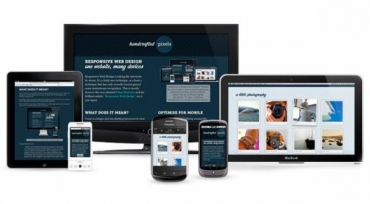
Your Browser
No. I’m not kidding. This is quite literally the most important tool you have, because it shows you exactly what your website looks like under your specific conditions.
There has been much debate about whether or not designing in the browser is better than designing in an image editor like Photoshop or GIMP. Allow me to resolve this for you…
Are your website’s users going to do their browsing in Photoshop? Image editors can make pretty pictures, not emulate actual experiences. Use image editors for editing images. Use your browser to design websites.
Innovative Tools
These are formidable problems we’re up against, but thankfully the web design community is up to the challenge. We’re seeing clever, thoughtful and downright innovative tools and resources emerging on a regular basis.There’s a lot to get excited about, but it can also be a huge task to keep track of the latest tips and tricks. This article takes a look at some of the most helpful responsive resources and tools that have emerged that will help you on your responsive journey.

Dreamweaver
Adobe Dreamweaver is a commercial application for web development that’s available for the Mac and Windows operating systems. Its featured-packed suite of tools and options include: syntax highlighting and very smart Code Hinting, a built-in FTP client, project management and workflow options that make team work effortless, and Live View – which shows you a preview of your source code. Dreamweaver tightly integrates with other popular Adobe products such as Photoshop, allowing you to share Smart Objects for quick and easy updating and editing of graphics components.
Style Prototypes
Based on Style Tiles, Style Prototypes are an in-browser deliverable designed to help you give your clients an idea of how their website’s typography, color, and UI elements will look. Since it is meant to be viewed in the browser, there will be fewer inconsistencies once the website is built.
Furthermore, I would posit that Style Prototypes could help our clients to mentally separate the concepts of UX and aesthetics. And really, anything that helps our clients to better understand the web design process can only be a good thing.
Bootstrap
Built by two guys at Twitter as a way to provide a clean and uniform solution to the most common, everyday interface tasks they faced as developers, Bootstrap is a “sleek, intuitive, and powerful front-end framework for faster and easier web development.” It uses a 12-column responsive grid system, and features dozens of components, styles and JavaScript plugins, with basic global display, typography and link styles all set.
Using the Customizer, you can really make Bootstrap your own, and customize variables, components, JavaScript plugins and more. Bootstrap can be expanded, with a wealth of resources available, to include themes and interface-building tools.

