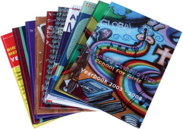
A yearbook is an important part of any graduating class. It serves as reminders of the people you grew up with, events that happened at school throughout the year and major accomplishments. This book is also the place where students leave each other lasting notes that allow them to look back on friendships that they may have lost over the course of their lifetimes and remember the good times they had prior to entering the real world as adults.

Because of its importance, the design and layout is very important. While there needs to be enough room for students to leave their messages, it is also important that it is filled with pictures from events from throughout the year.
Here are a few factors to take into consideration to make your layout clear, meaningful and with just the right amount of space for messages.
- Page subject
Depending on the subject of each page, emphasize photos or text to get your message across clearly. For example, if the subject of a page is the swim team, you will most likely want to focus on pictures from swim meets and team photos. Text around these photos should be smaller and should not stand out on the page.
- Size
This goes together with the subject of the page. Consider the importance of each item on the page when deciding how large or how small to make it. Typically, the title of the page is the largest item because it is the most important to people who skim through trying to find something specific. The smallest should be descriptions as they are not read as often.
- Splitting the page in thirds
A general design rule is to use pages in thirds to make it easier to read. This draws the reader’s eye to the areas where you want them to read. Highlight the areas you want the readers to see in the center of the page. For this approach, it is not necessary to draw boxes around the three areas of the page, but it is a good idea to keep in mind when designing.
- White space
As mentioned, students will want to write messages to each other. Leave enough white space around pictures so that they can create their own captions, and add in extra pages with white space so that students have ample room to write messages.
Visit websites such as memorybook.com for more helpful tips and layout ideas to get started!
Amanda is an avid writer. She highly enjoys writing about yearbooks. If you’d like more information regarding memorybook.com, please visit http://www.memorybook.com

